Ever wonder why two similar Wicker Park condos can list at very different prices just a few blocks apart? In many cases, the difference comes down to how quickly you can walk to the CTA Blue Line at Damen and the reliability that brings to your daily routine. If you are weighing a purchase, a house hack, or an investment, transit access can be the quiet variable that drives price, days on market, and rent. In this guide, you will learn how proximity to the Blue Line typically shows up in value, the tradeoffs to consider, and a simple framework to measure the local premium around Damen. Let’s dive in.
Why transit access matters in Wicker Park
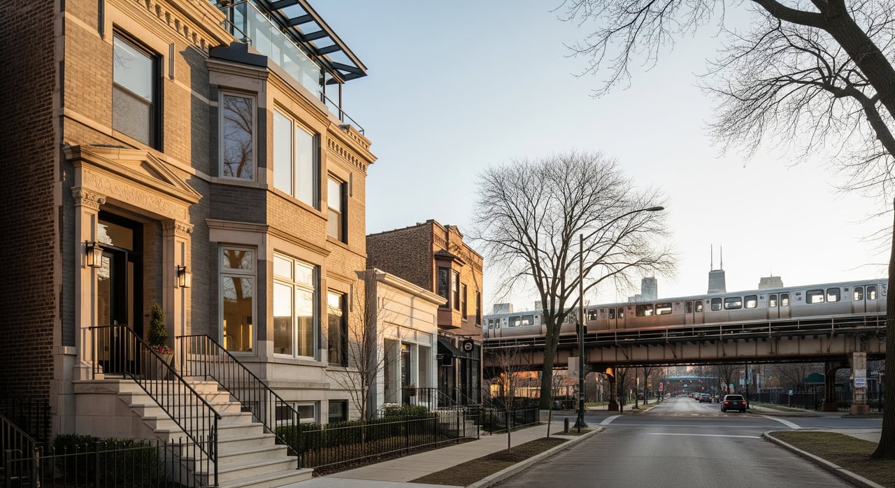
Wicker Park’s principal Blue Line connection is the Damen station on the O’Hare branch. The Blue Line offers high-frequency, direct service to the Loop, O’Hare Airport, and the Forest Park branch via the main trunk. For many commuters and frequent travelers, shaving minutes off a trip and having a reliable rail option is worth paying for, and that preference shows up in both sales and rental markets.
Distance bands that shape value
Researchers and local practitioners often analyze value in consistent walk bands that mirror real behavior:
- 0–0.25 mile, about a 5-minute walk. This is where most of the transit premium shows up.
- 0.25–0.5 mile, roughly a 5–10 minute walk. Still attractive for many buyers and renters.
- 0.5–1.0 mile. Diminishing returns for many households, but still relevant for cyclists and car-light residents.
Using these rings helps you compare apples to apples and align expectations with how people actually move through the neighborhood.
What studies say about price and rent effects
Sale prices and premiums
Across U.S. cities, academic literature and market reports consistently find a positive association between proximity to high-frequency rail and residential sale prices. Typical observed premiums span from low single digits up to the mid-teens percentage points for properties within an easy walk of frequent rail service. The exact uplift in Wicker Park should be calculated from recent local sales, controlling for property features like size, age, renovation level, and parking.
Days on market and liquidity
Homes near frequent rail often sell faster in transit-oriented, high-demand neighborhoods. In Wicker Park, being within a short walk of Damen can broaden your buyer pool to include commuters and car-light households, which can reduce days on market. That said, DOM differences vary by inventory, season, price tier, and property type, so you should analyze like-for-like comparisons before drawing conclusions.
Rental demand and rent levels
Proximity to rapid transit expands the renter pool. In competitive areas, buildings within a short walk of the station often see lower vacancy and quicker lease-ups. Rent premiums tend to be positive near frequent rail, though the size of the premium depends on unit type, finishes, and amenities. For investors, it is important to weigh the rent-per-square-foot benefit against the higher acquisition price near the station.
Wicker Park factors that shape the Blue Line effect
Demand-side strengths
Wicker Park’s active retail, dining, and arts scene increases non-commute trips, which makes walkability and transit access even more valuable. Reliable Blue Line service to the Loop and direct airport access add appeal for workday commuters and frequent travelers. The neighborhood’s bike lanes and Divvy stations extend the practical reach of the station beyond pure walking distance.
Supply, development, and policy
The housing mix near Damen includes vintage walk-ups, multi-unit buildings, and newer condo developments. New construction near transit often prices in the convenience premium. Over time, additional supply from redevelopment can moderate upward pressure on resale values or rents. Short-term rental activity and condo conversion patterns can also influence investor yields and pricing dynamics.
Micro-location tradeoffs near the station
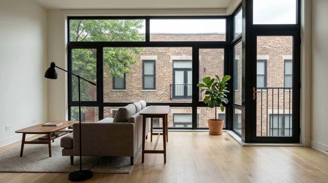
Transit premiums can vary block by block. Homes directly adjacent to Damen or along busier commercial corridors may capture the greatest convenience. At the same time, those same blocks can experience more pedestrian activity, nightlife noise, or parking stress. A property one or two blocks off a high-activity street can strike a different balance of access and quiet. The right tradeoff depends on your lifestyle and investment goals.
How to quantify the Blue Line premium locally
Key metrics to track
- Price per square foot for closed sales by distance band and property type
- Median sale price by distance band
- Days on market by distance band
- Rent per square foot and vacancy indicators for comparable rental units
- Investor yield metrics such as gross rent multiplier and cap rate estimates
Step-by-step method you can replicate
- Define your time frame. Use the last 12 months for a current snapshot, or a 3-year window for trend context.
- Pull closed sales for Wicker Park. Separate condos, small multifamily, and single-family homes so you are not mixing product types.
- Map distance rings around Damen. Use 0–0.25, 0.25–0.5, and 0.5–1.0 mile bands to classify each sale.
- Compute your baseline stats. Calculate median price, price per square foot, and median DOM for each property type within each ring.
- Control for property features. Adjust for bed and bath count, unit size, parking, year built, and renovation level using a regression or matched-pair approach.
- Analyze rentals. Compile advertised or achieved rents for similar units, then compute rent per square foot and compare across rings.
- Present results in both dollars and percentages. For example, show how price per square foot within 0.25 mile compares to the 0.5–1.0 mile band.
- Add neighborhood context. Note station boarding trends, recent nearby development, or service changes that could influence short-term demand.
Quick checks for a fast read
If you do not have time for a full analysis, you can still get a feel for the market using a few simple comparisons:
- Compare median price per square foot for similar condos within 0.25 mile vs. 0.5–1.0 mile.
- Compare median DOM for those same groups to gauge liquidity.
- Compare average advertised rent per bedroom or per square foot for comparable units in each ring.
Practical takeaways for buyers and investors
For commuters and lifestyle buyers
- Convenience carries weight. In Wicker Park, a short walk to Damen typically aligns with stronger demand and can support a higher price per square foot.
- Focus on fit. Decide if you prefer the energy of station-adjacent blocks or the quieter feel a bit farther out. Tour at different times of day to assess noise and activity.
- Think long term. Transit proximity can bolster resale appeal and liquidity, but appreciation still follows broader market cycles and local supply.
For investors and house hackers
- Balance price and yield. Near-station premiums can compress cap rates. Verify that higher rents and lower vacancy offset the higher purchase price.
- Underwrite by ring. Build separate pro formas for 0–0.25, 0.25–0.5, and 0.5–1.0 mile to see how rent per square foot and turnover vary with distance.
- Mind micro-location. Weigh the leasing advantage of a busier corner against potential noise or parking issues that could affect tenant satisfaction and renewal.
How Blue Line access shows up in the numbers
While the exact Wicker Park premium should be calculated from current local data, the broader research is clear. In many U.S. markets, well-located homes within a short walk of frequent rail service show sale price premiums in the low single to mid-teens percentage range. Rental premiums exist too, though they are often smaller on a percentage basis. In high-demand, transit-oriented neighborhoods like Wicker Park, that accessibility advantage tends to support pricing and liquidity beyond what similar but car-oriented locations achieve.
A simple plan to move forward
- Define your goal. Are you optimizing for daily convenience, future resale, cash flow, or a combination?
- Narrow the map. Decide which walk band fits your lifestyle or return targets, then focus search efforts there.
- Build comps with discipline. Compare like for like by property type, size, condition, and parking, and stay consistent with your distance bands.
- Stress-test your assumptions. For investments, run best, base, and conservative scenarios that reflect rent, vacancy, and exit timing.
- Check the block. Walk the route to Damen, visit at commute hours and late evening, and note noise, lighting, and activity that matter to you or your renters.
When you make decisions with data and on-the-ground context, the Blue Line becomes a strategic advantage rather than a mystery variable in pricing.
If you want help pulling neighborhood comps by walk band, modeling rent and yield, or weighing tradeoffs block by block around Damen, our team can partner with you from underwriting to leasing. Start your next move with the Joe Kotoch Group.
FAQs
How does Blue Line proximity impact Wicker Park sale prices?
- Studies show a positive association between frequent rail access and sale prices, commonly in the low single to mid-teens percentage range for close-in properties, but the Wicker Park figure should be estimated from recent local sales that control for property features.
Does living near Damen reduce days on market?
- Homes near frequent rail in high-demand neighborhoods often sell faster, though DOM differences depend on seasonality, price tier, inventory, and property type, so compare like-for-like.
Do renters pay more to be near the Blue Line?
- Many renters value rapid transit and will pay a rent premium near stations, with lower vacancy and quicker lease-ups often observed, but net yield depends on acquisition price and operating costs.
Are there downsides to being very close to the station?
- Station-adjacent blocks can experience more noise, pedestrian traffic, and parking stress, so evaluate micro-location and visit at different times to confirm the fit for your needs.
What is the best way to measure the Wicker Park premium?
- Use consistent distance bands around Damen, compute price per square foot, DOM, and rent per square foot by property type, and adjust for features like size, age, parking, and renovation to isolate the proximity effect.